


Design Experts Break Down Trump’s ‘Garish’ White House Makeover
Interior designers and art experts are reacting strongly to President Donald Trump’s flashy White House redesign.
President Donald Trump's major changes to the White House design have drawn attention and anger.
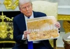
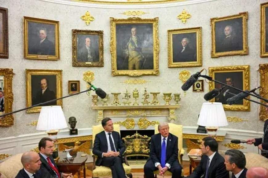
From the gold-filled Oval Office to the renovated presidential bathroom and the controversial ballroom project, his updates create a distinctive look that critics say is at odds with the historic White House architecture. Some have compared it to a suburban Thai restaurant, a sleazy casino, or a theater set—with an emphasis on spectacle over detail.
HuffPost spoke with interior designers and art experts to learn what these choices reveal about the president's taste, power, and the personal brand behind them.
"My first impression was that the redesign completely ignored the architecture that lies beneath," said interior designer Sarah Boardman. "The White House is a blend of Palladian and Georgian Neoclassical design, with beautifully restrained Irish influences, soft curves, elegant proportions, and detailed plasterwork that already gives the room all the decoration it needs."
He said that previous presidents have generally respected that foundation, even if they chose bolder carpets or richer fabrics.
"This redesign goes in the opposite direction," Boardman said. "The gold isn't integrated into the architecture—it's layered on top of it. The appliqués and ornaments look as if they were bought in bulk and placed everywhere rather than thoughtfully chosen. It's more reminiscent of French Baroque and Rococo, the 'let them eat cake' era of Versailles, than anything in the White House's true design lineage."
Art historian Robert Wellington, author of "Versailles Mirrored: The Power of Luxury, from Louis XIV to Donald Trump," said this aesthetic is reminiscent not just of Versailles, but also of a grand European palace tradition that was later adopted by America's Gilded Age elite.
"Trump has long shown an interest in the Louis XIV style, the look and feel that people associate with Versailles," Wellington said. "What I'm really seeing is a tradition built on the design of European palaces, aimed at projecting royalty. In the Gilded Age, America's robber barons borrowed those strategies to show off their social ascendancy. Trump is taking a cue from that and essentially bringing his own kind of corporate-branding strategy to the White House. The idea is that if he surrounds himself with luxury items, it shows that he is the kind of person who should lead the country."
Politics: See what Donald Trump has done to the Oval Office
Interior designer Kelly Wagner – who has posted numerous TikTok critiques of the current president's design choices – drew comparisons to the opulent interiors shown in photos of Louis XIV's Versailles and even Vladimir Putin's alleged home.
"Both the Sun King's Versailles and Putin's home are 'palaces,' and were not designed as public spaces," she said. "I believe President Trump has a personal attachment to these designs because he believes they convey elegance and power."
The designers said the Versailles-like approach is particularly strange because of how different it is from the building it is in, both symbolically and visually. Wagner said the Rococo-style gold appliqués now covering the space actually look out of place.
"These slender designs are a departure from the Neoclassical style, which focuses more on geometric shapes," she said. “Also, applying these pieces directly over wallpaper, marble fireplace surrounds, and gold leafing on existing elements is a bit different.”
Home: We asked interior designers about Trump's 'ostentatious' White House redesign—and they had ideas
This scene is truly remarkable. “In ancient times, gold was used extensively to show wealth and power,” said Zoe Warren, interior design expert at PriceYourJob.co.uk. “For Trump, the use of gold is meant to convey a sense of success in both business and politics.”
She added that Trump's gold look is “undoubtedly luxurious”—a deliberate choice to impress and add drama to the baroque interior style. Because people consider gold to be precious, its excessive use can instantly create a sense of grandeur.
"Gold has always been associated with status, legacy, and importance, so using it so heavily in a political space sends a very clear message," said Andrew Shoukri, interior designer and founder of Venus House. "It's meant to make you feel powerful as soon as you walk in. Metallic finishes feel formal and almost theatrical, while heavy fabrics and ornate details create a permanent feeling."
This theatricality becomes even more effective in a symbolically important space like the Oval Office.
Politics: Trump is adding 'flamboyant' gold details to another iconic area of the White House
Boardman said, "Covering its neoclassical detailing with gold appliqués and props makes it feel more like a set, not a workspace." "The addition of red ropes, stage lighting, it all feels more like a soundstage than the People's House."
He compared this effect to other environments designed to display personal power.
Boardman said, "Casinos use high-gloss gold to create a sense of grandeur, wealth, and heightened reality, a place where you should feel like anything is possible."
Wellington also pointed to the inherently ostentatious quality of Trump's manner.
Home: Interior designers offer their opinion on the 'confusing' White House holiday decor
"There's too much ostentation," he said. "Trump could be meeting with a foreign leader in front of a mantelpiece he decorated with all things gold, and it's the backdrop for a performance by a successful businessman who is now president."
He added that the space has a slight nod to the documentary "Queen of Versailles," which followed Florida socialite Jackie Siegel and her quest to build a Louis XIV-inspired megamansion.
Warren said, "This design says a lot about Trump's personality." "He loves to be the center of attention, and the new gold-filled design of the Oval Office is certainly grabbing headlines."
Designer and artist Isabella Segalovich similarly noted the attention-grabbing aspect of this space.
"From a purely aesthetic perspective, the sheer amount of gold in the room almost chokes the space, preventing anything else from breathing," she said. "Like many other things about Trump, it's a demand for our attention."
But she sees something more to it. "It's important to note that Trump is a troll of sorts," Segalovich said. "I think it's quite likely that he enjoys the waves of anger generated by decisions like pouring concrete over the Rose Garden and demolishing the East Wing of the White House. 'Downing the Libs,' after all, is as much a part of his brand as red hats and cheap gold decals."
It also has a profound symbolic impact.
Boardman emphasized that the issue isn't just aesthetic, but also philosophical.
"The Oval Office is a public room, not a personal living room," he said. "It's the most sacred space of American leadership, and historically it's designed to project restraint, stability, and quiet confidence. World leaders, children, military families, anyone who enters that room should feel safe and grounded."
In previous administrations, presidents have added personal touches while respecting the space's architecture and purpose.
Boardman said, "Even when the colors changed—Reagan's pink, Bush's multi-toned blue, Obama's orange curtains and contemporary art—the choices still respected the architecture and conveyed calm, civic power."
Wellington echoed this sentiment, saying, "Before, it was a very serious, quiet place. It was a place for business and contemplation. It was a place for the duties of office."
In contrast, Trump's new design exudes "privilege and hierarchy" and suggests there's no place for the public.
Boardman said, "If he could, I think he would completely rebuild the West Wing with gold, mirrors, and marble tiles, a chamber of reflection rather than governance. But the White House was never built to glorify any one person." "Its architecture was designed to outdo them."
He further stated that the new Oval Office conveys a message of personal power rather than public service.
"In this context, the gold is a constant reminder of his status, power, and wealth," Boardman said. "It feels like compensation rather than confidence, an environment designed to project a certain image, even if it doesn't fit the room's history and purpose."
Interior designer Liz Potarazu made a similar point about this lack of alignment between the intended display of prestige and its actual impact. "It feels more like ostentatious authority than confident leadership, a display of dominance rather than an office based on collaboration and policymaking," he said.
The distinctive color of the gold is also noteworthy.
Interior designer Diana Lombard believes Trump's use of decorative, overly shiny gold ultimately didn't have the impact he might have hoped for.
"Gold with a plated, high-shine finish appears more yellow than genuine antique brass, making it more showy than distinctive," he said. "On the other hand, genuine brass has depth, nuance, and detail. It's a more nuanced, sophisticated gold that develops a natural patina over time and, in my opinion, more accurately reflects craftsmanship and genuine luxury, thus conveying wealth more than plated gold."
Several experts have noted that the gold in Trump's Oval Office appears almost green in photographs, possibly due to lighting choices. Furthermore, the distinctive shade and finish appear odd in the architectural context of the White House.
Boardman added, "When juxtaposed against genuine gold-leaf frames for portraits like Washington or Franklin, the contrast is too stark." "One is historic crafts ― the other is imitation. I'm not saying there isn't a place for that aesthetic in certain spaces. But this room and this architecture aren't that. Because they left the existing wallpaper from his first administration, the gold clashes, and the lighting on the TV set enhances the canned gold."
He stressed that gold can work when it's "soft, warm, and used as an accent." The Oval Office during Trump's first term was closer to that tradition.
Boardman said, "Damask wallpaper, soft gold drapes, coral-and-cream carpet ― it didn't ruin the room," adding that the second term redesign is quite different. “Such heavy, shiny, ornamental gold isn't just decorative; it's symbolic. In a political setting, such metallic sheen attempts to convey dominance, hierarchy, and self-focus. It transforms the Oval Office from a working space into a stage set.”
That "stage set" quality becomes even more apparent when you look at the detailing.
Segalovich said, "As some have pointed out, some of the gold decals look like cheap polyurethane decorations you can buy for just $1 on the Chinese e-commerce website Alibaba."
Wellington said it's not just a matter of taste, but also of symbolism.
He said, "One could argue that some of these choices cheapen the office and make it less respectable, as they bring in the visual codes of capitalism and corporate space."
It's also worth noting its divergence from current design movements.
"I think people have responded so strongly to Trump's Oval Office redesign because it's so different from current trends in design," Lombard said. "In a world filled with AI and social media, where the line between real and artificial often seems blurred, people are gravitating toward natural, organic materials and textures that convey authenticity."
Current design sensibilities lean toward warmth and environments that feel genuine and welcoming, rather than overly ostentatious or overly decorative.
Boardman said, "Design today has moved even further away from excessive decoration." "Whether it's high-end residential, hospitality, or institutional design, we're seeing a shift toward soft palettes, matte finishes, natural materials, neurodivergent-friendly textures, and calm, grounded spaces."
In contrast, he added, Trump's Oval Office "is more akin to luxury casinos, resorts, and themed environments like the MGM Grand than any current design movement."
Potarazu observed a similar shift in the design industry.
"At our firm, we're seeing a strong shift toward 'quiet luxury'—matte finishes, natural materials, and very little flashiness," he said. "Clients are increasingly moving away from shiny, yellow gold finishes and returning to more timeless metals like polished nickel, aged brass, and antique bronze. There's also a resurgence of the 'old-money aesthetic,' which doesn't translate to this version of the Oval Office. It actually feels like 'new money.'"
The "Presidential Walk of Fame" and the Oval Office sign are also particularly odd additions.
Segalovich said, “To me, the embellishments, maximalism, and even the use of a little gold leaf aren't as much of a problem as the oversized decals that look like flaming flames above the framed portrait.”
Ultimately, the design portrays Trump as a brand rather than a leader of the people.
“Especially at a time when his policies are making it difficult for ordinary people to make ends meet, it's obviously very wrong for him to flaunt how much money he's spending on these designs,” Segalovich said. “To me, the most important thing we can tell from Trump's design sense is not that it's ostentatious, but that it's lifeless.”
What's Your Reaction?
 Like
0
Like
0
 Dislike
0
Dislike
0
 Love
0
Love
0
 Funny
0
Funny
0
 Angry
0
Angry
0
 Sad
0
Sad
0
 Wow
0
Wow
0